
PS IMAGO PRO
Implement tasks in statistical data analysis, reporting and data processing.
Combining IBM SPSS Statistics with tools for creating reports and publishing data. PS IMAGO PRO completes the data analysis process in one environment.
Why PS IMAGO PRO?
Perform basic and advanced statistical analysis within intuitive and user-friendly software, with capabilities raging from basic descriptive statistics to advanced modelling and machine learning techniques.
Primary PS IMAGO PRO Procedures
Cluster Evaluation
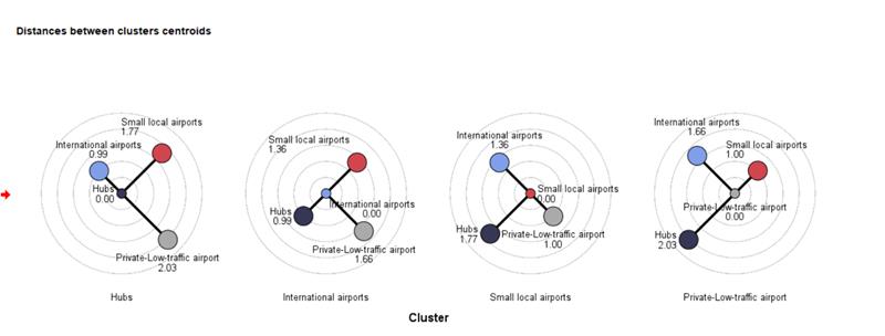
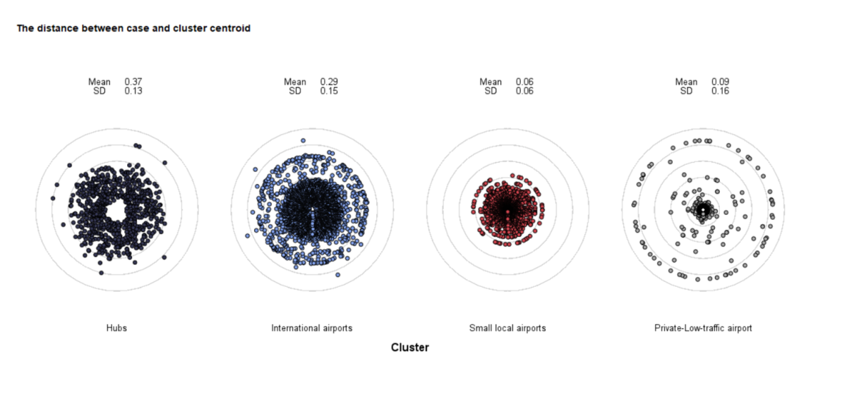
The Cluster evaluation procedure assesses the quality of grouping by generating key metrics such as Total Silhouette value, descriptive statistics for Silhouette, and group centroid distances. It helps evaluate individual observations, groups, and models using the Silhouette coefficient, which measures group cohesion and partitioning, with values ranging from -1 to 1.
Additionally, it supports various string distance measures like Jaro, Jaro-Winkler, Hamming, Levenshtein, and more, allowing for detailed comparison and scoring of string variables. This procedure enhances data analysis by providing comprehensive insights into group quality and similarity, facilitating more accurate and meaningful evaluations of clusters.
Cramer’s V Correlated Variables
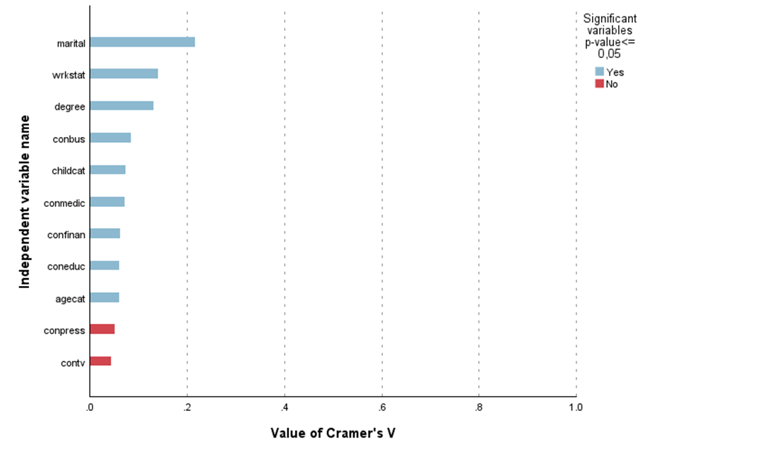
The Cramer’s V correlated variables procedure is highly useful for data analysis as it quickly verifies the strength of correlation between a set of independent variables and a dependent variable, measured at nominal and ordinal levels. It generates a table and chart displaying Cramer’s V correlation values and significance levels, facilitating the selection of relevant independent variables for further analysis.
This helps in better understanding the relationships between variables, although it is important to note that correlation does not imply causation. The procedure’s ability to present ordered correlation values and significance levels in a clear, visual format makes it an efficient tool for identifying and analysing key variable interactions.
Dartboard
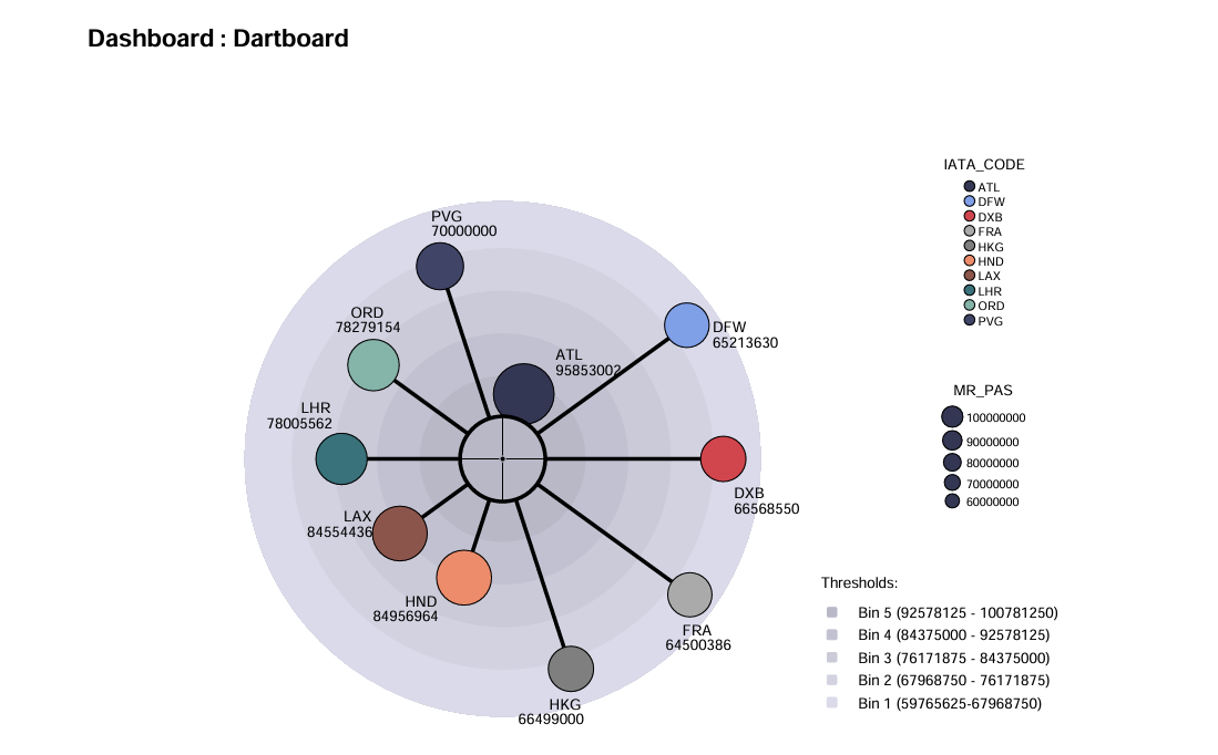
The Dartboard procedure visualises a comparison of an index in groups determined with categories of a qualitative variable. The procedure shows results in the form of a dartboard. Individual categories are represented by points. The closer a category is to the centre of the dartboard, the higher the value of the coefficient.
This visualization is particularly useful because it provides a clear and intuitive way to compare the performance or value of different categories at a glance. By representing data in a dartboard format, it allows for quick identification of which categories are performing better or worse relative to others. This can be especially helpful in making informed decisions, identifying trends, and understanding the distribution of values across different groups
Arrows and Traffic Lights
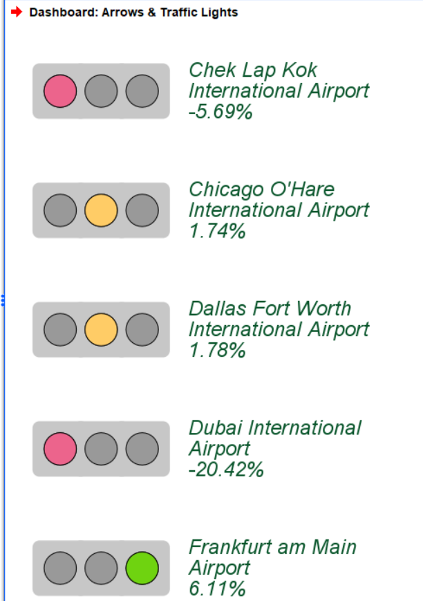
Arrows and Traffic Lights display index results for different categories of a qualitative variable in dashboards. Arrows mode shows value changes with angle and colour between two time points, while Lights mode uses traffic-light-like objects to indicate performance. These tools help quickly assess performance, identify trends, and highlight areas needing attention.
Balance Distribution
The Balance Distribution procedure balances variable categories in data sets by equalizing their frequency. It randomly excludes records from the more common category until both categories match, creating a pointer with values 0 (exclude) or 1 (include). The new variable is named with a _balance suffix. This method helps prepare balanced data for modelling, reducing bias, and improving model generalisability.
Data Inventory
The Data Inventory procedure finds and describes IBM SPSS Statistics data files (.sav) within a chosen folder and its subfolders. It generates a report detailing attributes like creation date, label, number of records, and variable information such as position, label, and measurement level. The report is shown in output and supports searches using regular expressions to match file names.
Data Inventory helps manage multiple datasets across large projects by providing an organized overview of relevant data files. Its detailed descriptions and customizable search options increase efficiency and accuracy in data handling.
Treemap
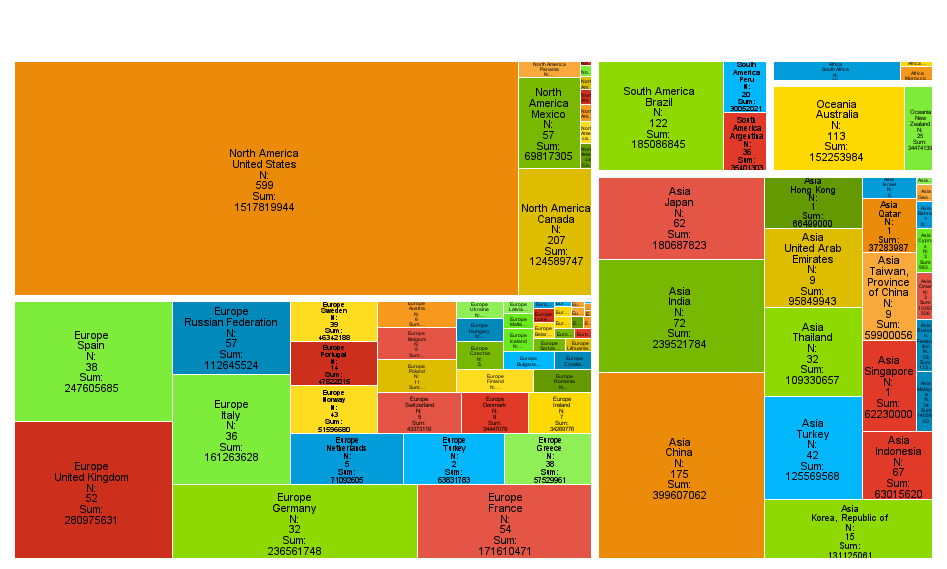
The Treemap is an intuitive mosaic plot used to visualize group statistics by dividing the surface of the map into segments proportional to their share of the total size.
When a quantitative variable is introduced, the segment sizes can be adjusted based on the variable’s sum percentage. Additionally, segments can be coloured using a target variable.
This type of chart is particularly useful for displaying hierarchical data and understanding the relative sizes of different categories. It also includes functions for describing leaf nodes using the classification tree technique, making it a powerful tool for analysing and presenting complex data in a clear and intuitive manner.
Waterfall Graph
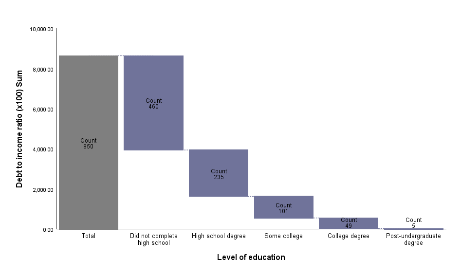
The Waterfall Chart is a bar chart in which the bars are located in reference to the y-axis depending on the location of the previous bar. Each consecutive bar begins at the end value of the previous bar. The
aggregate value is shown with a Total bar. The bars may represent the size for a primary variable category or totals for a quantitative variable.
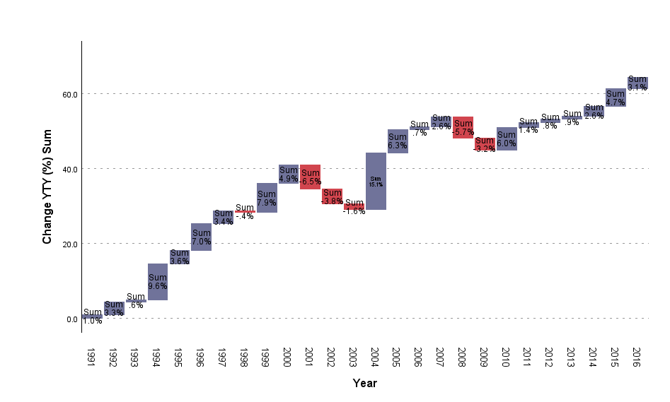
The Waterfall Chart is usually used to help understand the contribution of individual elements into the aggregate result. It shows what part of the total value is provided by individual categories of the variable. It can also be used to present the aggregate result of consecutive positive or negative values. Positive and negative values are in different colours
Series Graph
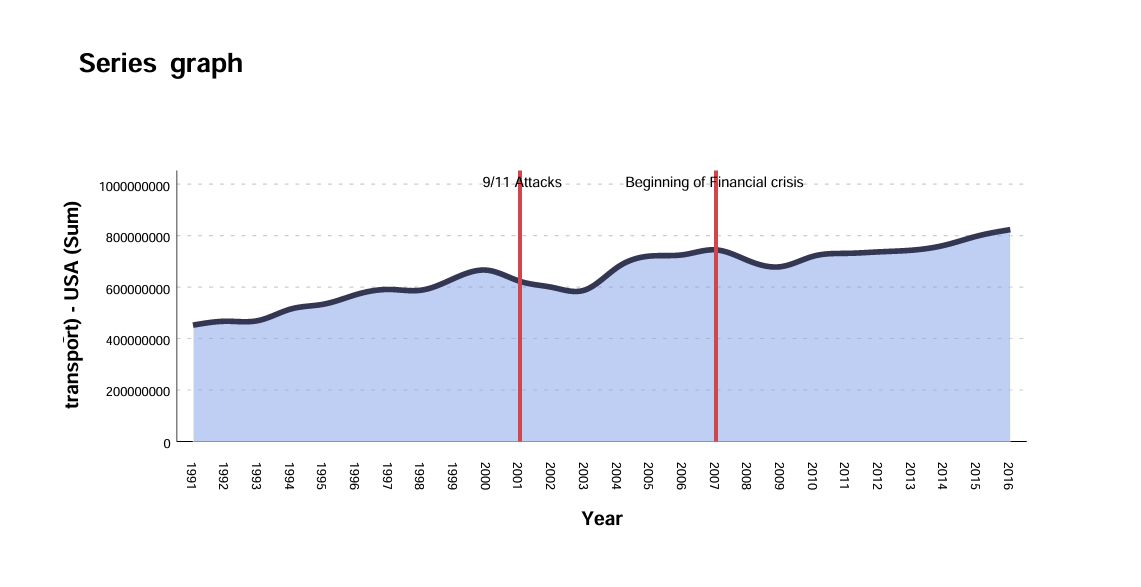
A series graph, or time series graph, is a line graph displaying data points measured at regular intervals over time. The x-axis shows time, while the y-axis represents the recorded variable. This type of graph reveals long-term trends, seasonal patterns, and cyclical patterns, and visualizes the impact of events clearly.
Split Text
The Split text procedure is invaluable for data pre-processing and analysis as it allows users to split a selected string variable into multiple new variables based on a delimiter or fixed width, ensuring clarity and consistency in the dataset. It offers flexibility with predefined or user-defined delimiters, handles case sensitivity, and allows setting limits on the number of variables, making data manageable and relevant. Additionally, it provides an option to summarize the outcome in the output viewer window, enhancing data preparation and facilitating efficient and accurate data analysis.
Reverse Coding
The Reverse Coding of Categorical Variables procedure helps to reverse the coding direction of categorical variables. Reverse coding is a technique used in survey design and data analysis to ensure the consistency and accuracy of responses. Reverse coding can recode multiple variables simultaneously, requires a prefix for new variables, and offers options to overwrite existing variables or halt if identical names are found. This procedure copies source variable labels, supports nominal and ordinal numeric variables, and codes user-missing data as the last category.
Industry-Leading Support to Make the Most of Your Advanced Analytics Software
Our Documentation & Support section provides 24/7 access to online fault logging and a dedicated IBM SPSS support team, as well as support documentation and FAQs.


